HELOC
We designed a HELOC product from the ground up for a digital lender: an application homeowners can finish from the couch, with clear language, smart defaults and one guided task list from pre-qualification to closing.
- Client
- Digital-first fintech lender
- Role
- Product design lead
- Timeline
- Design 3 months · Launch 7 months
- Platform
- Responsive web
Overview
Services: Competitive analysis, User research, User flows, Wireframes, High-fidelity UI, Clickable prototype.
Getting a HELOC has always been slow, confusing, document-heavy and tied to in-person banking. Our client wanted to launch quickly for homeowners who need cash but don’t want to give up a low mortgage rate — without the marketing budget or brand awareness of the big banks.
Working to a tight, high-visibility timeline, we led competitor analysis and user research while getting up to speed on the domain, then moved through user flows, wireframes and high-fidelity prototypes to align the team and validate ideas early. The result is a fast, transparent journey from qualification to funding that gives borrowers confidence and control.
How do we create an application that’s fast, clear, and simple enough to finish from your couch?
The problem
Slow and paperwork-heavy
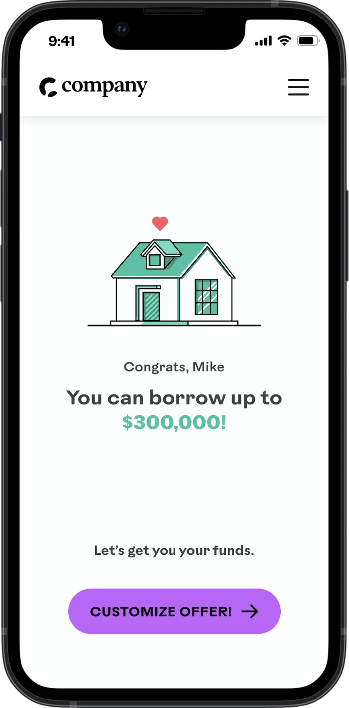
The problem: A traditional HELOC can take weeks. Between income verification, document uploads and manual back-and-forth with a loan officer, the process feels outdated and exhausting.
What we did: We streamlined everything into one digital flow. Borrowers check eligibility, upload documents and track progress in one place — no printing, mailing or waiting for a call.
For users: Homeowners see a real offer in minutes, not weeks — and keep their low mortgage rate.
HELOCs are confusing
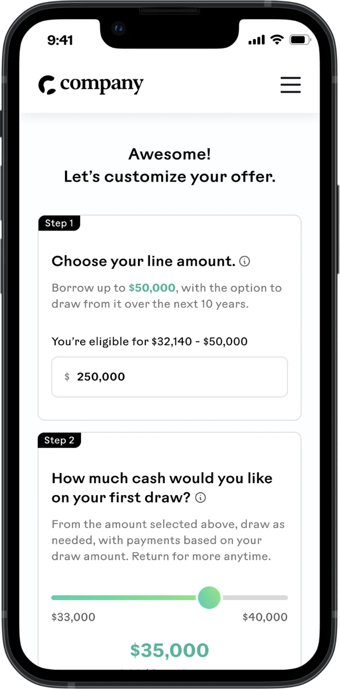
The problem: Most people don’t know how a HELOC actually works. Terms like “line amount” and “draw amount” are rarely explained, leaving borrowers guessing how much they can access and when they repay it.
What we did: Plain language, guided steps and smart defaults. Education is built into every screen so borrowers understand exactly what they’re signing up for — without needing a banker.
For users: Borrowers understand exactly what they’re agreeing to before they commit.
A disconnected flow
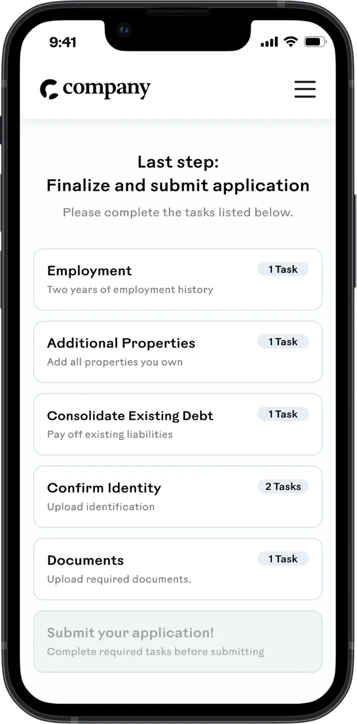
The problem: In the lender’s existing loan product, tasks were scattered across screens with little context. People left to hunt for documents, lost momentum and dropped off.
What we did: A single task list that sets expectations up front and groups steps logically on one screen, so borrowers stay focused, know what’s next and move through without interruption.
For users: People always know what’s next and how long it takes, so fewer give up halfway.
It required showing up in person
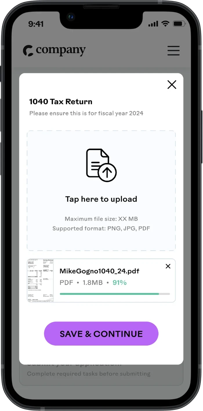
The problem: Most HELOCs still mean a branch visit, a stack of paperwork and a notary appointment just to move forward.
What we did: Every step can be completed from home — application, document upload and e-signing included. No appointments, no travel, no pens.
For users: No branch, no notary, no time off work — the whole thing happens from home.
Outcomes: Launched on schedule — then tuned with real borrowers
- 3 mo from blank canvas to launch-ready design
- 100% digital — application to closing
- 1 task list replacing scattered screens
After launch we followed up with borrowers and reviewed session replays, turning every point of friction into a prioritized plan for phase two.