Aligncn
Aligncn is the design system we built for our own work — and now sell to other teams. Every Figma component has a matching React component built on shadcn/ui, Tailwind and TypeScript, so design and development never drift apart.
- Client
- ProductBloom product
- Role
- Design, build & brand
- Timeline
- Core launched Q3 2025 · ongoing
- Platform
- Figma + React / Next.js
Overview
Services: Design tokens, Component library, Dashboard templates, Documentation, Marketing site, Brand.
Every product team rebuilds the same components — tables, forms, charts, navigation — and then spends months keeping Figma and code in sync. We wanted a foundation we could start every project from.
Aligncn is built with auto-layout, variables and design tokens in Figma, and a matching library of production-ready React components in code. It ships with complete templates — dashboards, AI chat, AI image generation, crypto, finance, music, projects, email, calendar and point of sale — plus login, sign-up and checkout flows.
Can a design system be so aligned with code that handoff disappears?
The problem
Starting from scratch, every time
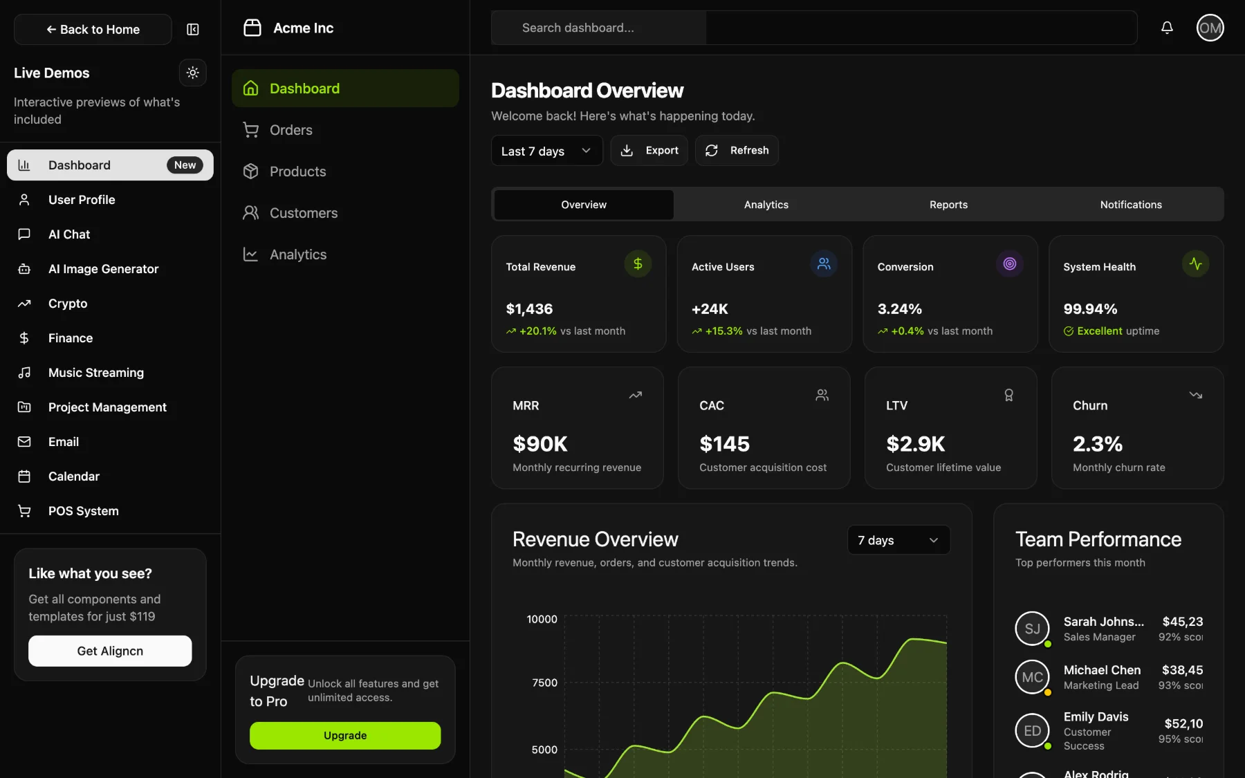
The problem: Teams burn weeks rebuilding buttons, inputs and tables before they touch the product problem.
What we did: 50+ components with variants, states and dark mode — ready to drop into Figma or copy into a codebase.
For users: Designers and developers start on the actual product on day one.
Design and code drift apart
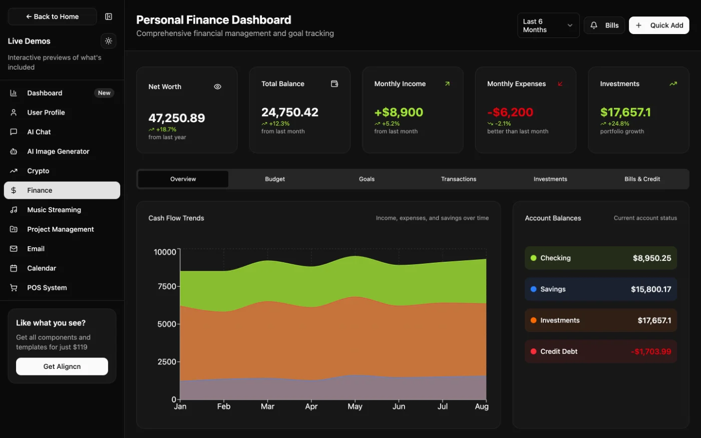
The problem: Figma files and React components diverge within weeks, and handoff turns into redlines and rework.
What we did: A 1:1 mapping between Figma components and React components, with developer-friendly tokens that match exactly.
For users: Developers build exactly what was designed, with no guesswork at handoff.
Components aren’t products
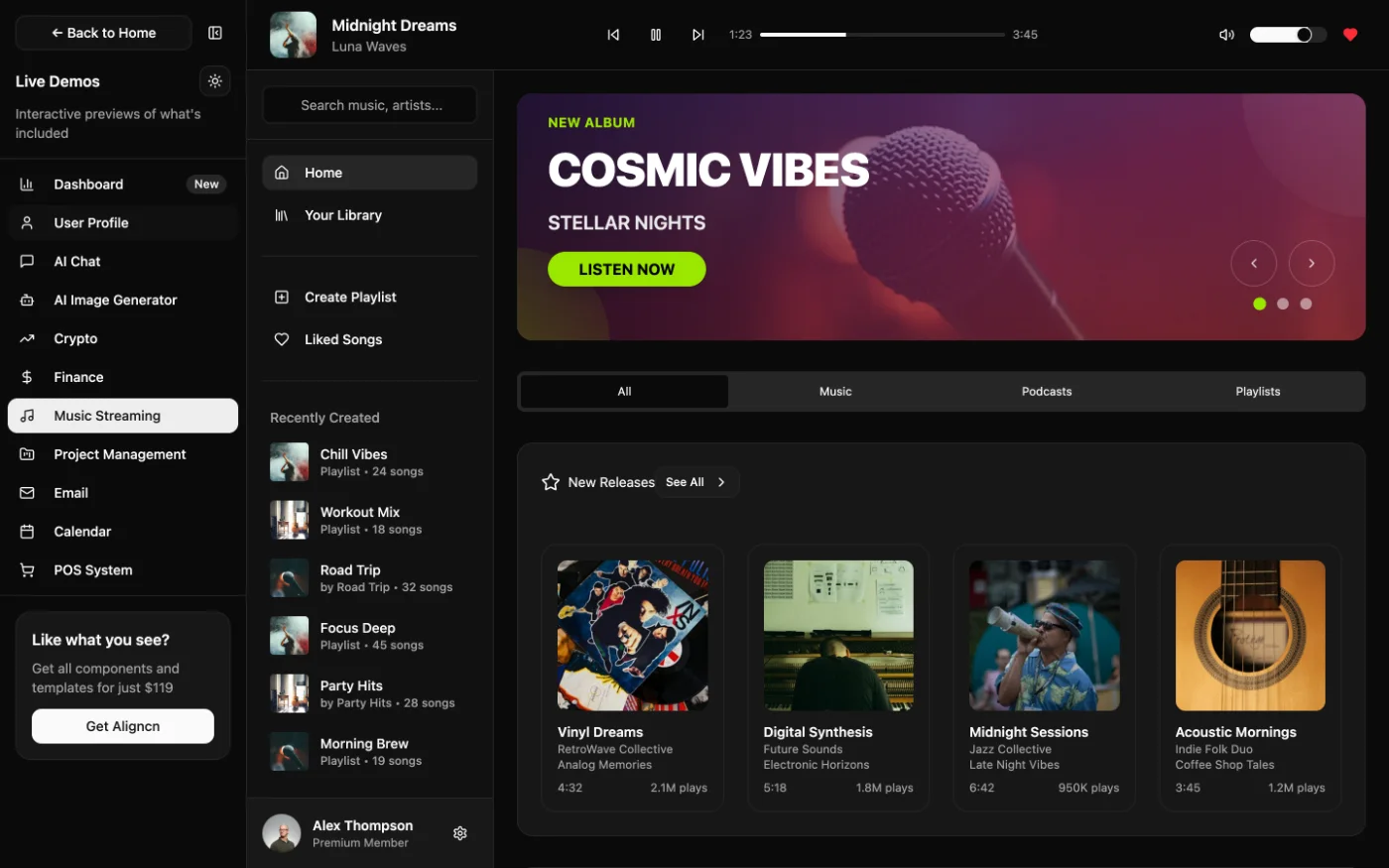
The problem: A kit of parts still leaves teams to design whole screens and flows.
What we did: Ten complete templates across industries show the system composed into real products you can customise and ship.
For users: Teams see how the pieces fit together before designing a single screen.
Kits go stale
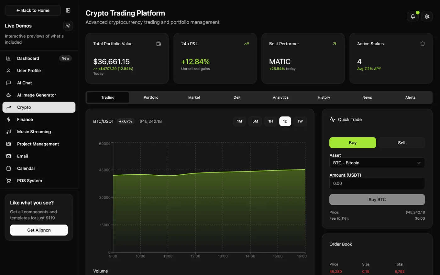
The problem: One-time kits fall behind the frameworks they’re built on.
What we did: Buy once, get lifetime updates — with a public roadmap covering onboarding flows, marketplaces, mobile templates, a Figma plugin and AI Figma↔code sync.
For users: The kit keeps working as React, Tailwind and shadcn/ui evolve.
Outcomes: A foundation we — and our customers — ship on
- 50+ components in Figma and React
- 10 complete dashboard templates
- 1:1 Figma-to-code parity
Built with React, TypeScript, Next.js, Tailwind CSS, shadcn/ui and Motion. Lifetime updates included.